


This is a temporary post that was not deleted. Please delete this manually. (2b086a4a-ba8c-4536-ade3-abce953bba12 - 3bfe001a-32de-4114-a6b4-4005b770f6d7)
Sunday, October 24, 2010
Monday, July 19, 2010
Black and White (with contrast)
When I first started getting serious about photography I wanted to make every photo black and white. It's classic, it's timeless, it hides flaws like colors being off or being a smidge out of focus. But I didn't know HOW to get a true black and white. There's a big difference between black and white and grayscale (or just desaturated). You don't want a gray image, you want darks and lights...blacks and whites.
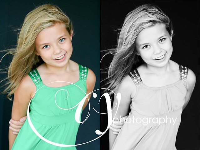
I'm starting out with this image. It's been opened in Camera Raw, given a bit of exposure boost and then opened in the PSE editor.
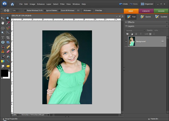
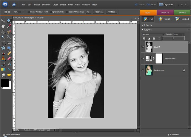
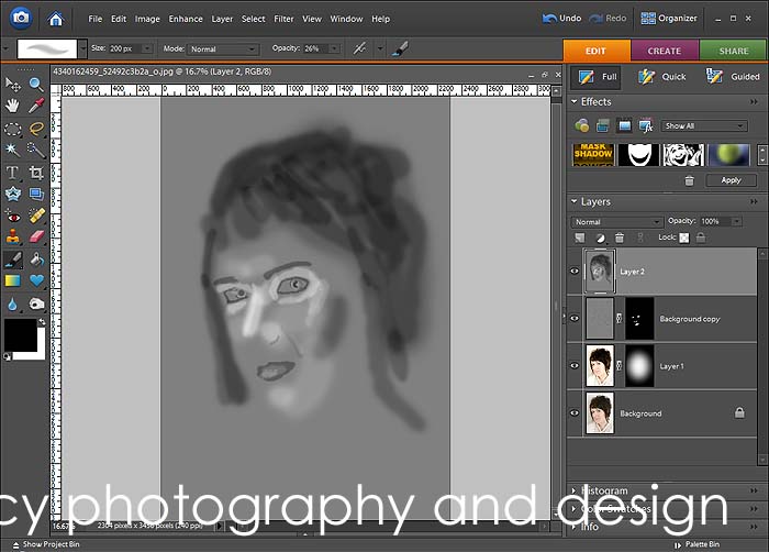
The next step is to make the image black and white, I do this by using a gradient map. There's even a preset for black and white. When you choose gradient map (which is in the Layer> Adjustment Layer>Gradient Map.) a dialog will pop up and you can choose the gradient, for this choose the one that says black and white when your mouse hovers over. It's the third box.
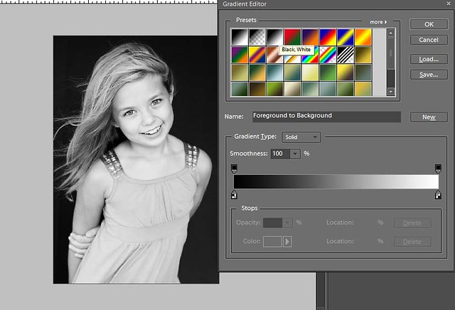
So, there the picture is technically black and white, but it still looks a little gray. I fix this by adding some more contrast, by means of curves. I'm using the SmartCurve plug in on a stamp visible layer (alt+shift+e). Just a slight s-curve and there's the contrast!
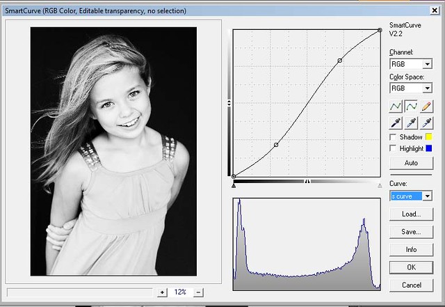
It's actually a little too contrast-y for me and since it's on it's own layer I can bring down the opacity of the layer.

I'm starting out with this image. It's been opened in Camera Raw, given a bit of exposure boost and then opened in the PSE editor.
The next step is to make the image black and white, I do this by using a gradient map. There's even a preset for black and white. When you choose gradient map (which is in the Layer> Adjustment Layer>Gradient Map.) a dialog will pop up and you can choose the gradient, for this choose the one that says black and white when your mouse hovers over. It's the third box.
So, there the picture is technically black and white, but it still looks a little gray. I fix this by adding some more contrast, by means of curves. I'm using the SmartCurve plug in on a stamp visible layer (alt+shift+e). Just a slight s-curve and there's the contrast!
It's actually a little too contrast-y for me and since it's on it's own layer I can bring down the opacity of the layer.

Monday, February 8, 2010
Basic Portrait Retouching
I've been wanting to compile my knowledge about portrait retouching for a while. I'm just using info that I've gathered here and there and I use what works for me. I hope you can take away something from this demonstration that will help.
Regarding skin tones: I'm really horrible at skin tone, I fix it until it looks decent to me...and I did nothing as far as tone of the skin for these examples.
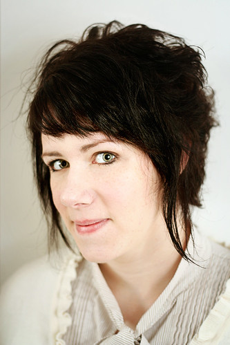
The photo on the left is SOOC, with flickr's sharpening and what not added. The photo on the right is what I've retouched. The subject...it's me. I couldn't justify putting another person's unedited photo up there, I might lose some friends :)
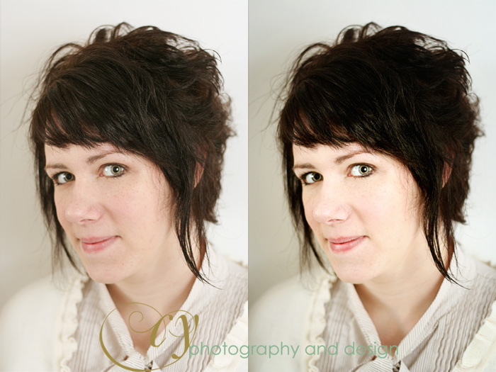
As usual, fix what needs fixing first. I opened this one up in ACR even though it was a jpeg and fixed the white balance (just hit Auto) and exposure. You might want to tweak the levels or remove blemishes also. My photo has a lot of wild hairs, and that's just how I left it...you gotta leave a little natural stuff in there right? (note: I'm just lazy)
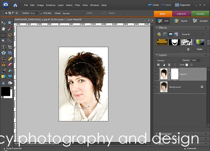
Next step (and I'm working in elements, so if you have an editor that does curves you can use an adjustment layer and these steps will be somewhat different.) First I duplicate the background and use SmartCurve to brighten the skin tone. I use this curve, I've saved it and that's my jumping point for skin tone.
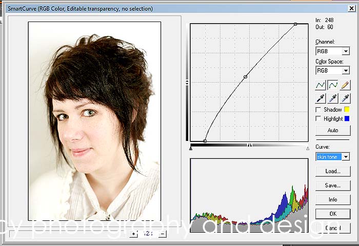
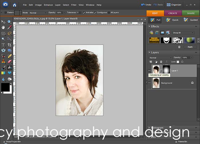
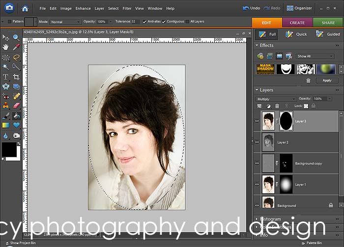
The next step is the mask it so that the skin tone adjustment is just on the skin and not everywhere. I want the face to be lit up and to bring focus on it. Create a layer mask and using the elliptical marquee select the face. Set the elliptical marquee to have about 50 px feather added. Invert the selection and fill with black.
That's pretty harsh, so do a heavy gaussian blur on the mask (I choose 250 px--all the way, baby!) I do that as many times as it takes to even it out. Adjust the opacity at this point if it's too bright.
After that I did some selective sharpening. In another tutorial I wrote about how to make eyes stand out, that's all I did. I sharpen the eyes and the mouth and other areas that need to be in focus.
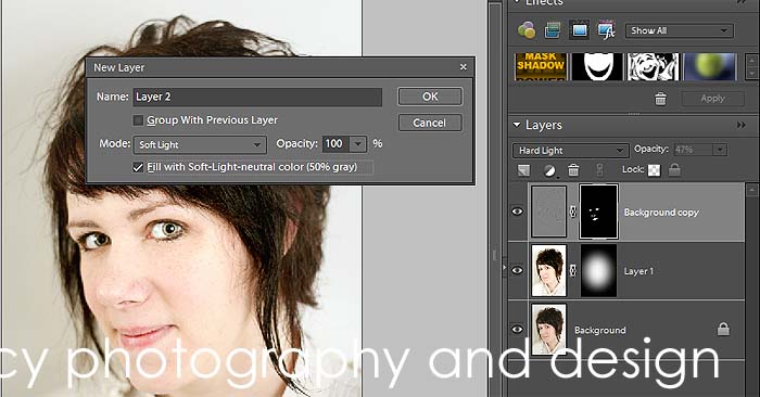
Next step is dodging and burning. I've always been afraid of dodging and burning and it's been a bit of a pain. The dodge and burn tools have a lot of different variables. So this is another easy way to get that effect, but using the brush tool and a new layer filled with grey.
Hold down alt and click the new layer icon (on the layers palette). When the dialog box pops up choose soft light from the drop down menu and tick the box that asks if you want to fill it with 50% gray.
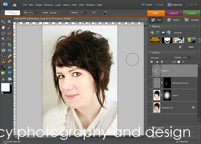
This next part is easy peasy. Set your brush to the default colors and lower the opacity way down (between 10 and 30%).
With black selected you can do things like: contour checkbones, darken the lashes and lashline, outline the iris, darken the pupil, darken the lips, fill in eyebrows.
With white selected you can do things like: lighten the whites of the eyes, lighten the teeth, bring out highlights, get rid of dark undereye circles, give a root touchup to blondes that aren't naturally blonde.
If you change your blend mode to normal at 100% you can see what you've done. Change it back to soft light and lower the opacity if it's too much. I intentionally left the opacity too high on my example to show you how powerful this is in a retouch.
The photo needed a little more contrast, so I'm going to do that with a soft light layer.
Create a new layer using stamp visible (ctrl+alt+shift+e). That new layer that appears is all of the other layers combined. Change blend mode to soft light and lower the opacity
So the next part is a vignette, and I've done this several ways, but I like this way the best for portraits.
Stamp visible again and set blend mode to multiply, then create a layer mask. Using the elliptical marquee select the majority of the photo, and fill the selection with black.
Using a heavy gaussian blur filter on the mask, blur it until there are no harsh lines and it fades nicely to the edges. Adjust the opacity, and you're done!
Regarding skin tones: I'm really horrible at skin tone, I fix it until it looks decent to me...and I did nothing as far as tone of the skin for these examples.
The photo on the left is SOOC, with flickr's sharpening and what not added. The photo on the right is what I've retouched. The subject...it's me. I couldn't justify putting another person's unedited photo up there, I might lose some friends :)
As usual, fix what needs fixing first. I opened this one up in ACR even though it was a jpeg and fixed the white balance (just hit Auto) and exposure. You might want to tweak the levels or remove blemishes also. My photo has a lot of wild hairs, and that's just how I left it...you gotta leave a little natural stuff in there right? (note: I'm just lazy)
Next step (and I'm working in elements, so if you have an editor that does curves you can use an adjustment layer and these steps will be somewhat different.) First I duplicate the background and use SmartCurve to brighten the skin tone. I use this curve, I've saved it and that's my jumping point for skin tone.
The next step is the mask it so that the skin tone adjustment is just on the skin and not everywhere. I want the face to be lit up and to bring focus on it. Create a layer mask and using the elliptical marquee select the face. Set the elliptical marquee to have about 50 px feather added. Invert the selection and fill with black.
That's pretty harsh, so do a heavy gaussian blur on the mask (I choose 250 px--all the way, baby!) I do that as many times as it takes to even it out. Adjust the opacity at this point if it's too bright.
After that I did some selective sharpening. In another tutorial I wrote about how to make eyes stand out, that's all I did. I sharpen the eyes and the mouth and other areas that need to be in focus.
Next step is dodging and burning. I've always been afraid of dodging and burning and it's been a bit of a pain. The dodge and burn tools have a lot of different variables. So this is another easy way to get that effect, but using the brush tool and a new layer filled with grey.
Hold down alt and click the new layer icon (on the layers palette). When the dialog box pops up choose soft light from the drop down menu and tick the box that asks if you want to fill it with 50% gray.
This next part is easy peasy. Set your brush to the default colors and lower the opacity way down (between 10 and 30%).
With black selected you can do things like: contour checkbones, darken the lashes and lashline, outline the iris, darken the pupil, darken the lips, fill in eyebrows.
With white selected you can do things like: lighten the whites of the eyes, lighten the teeth, bring out highlights, get rid of dark undereye circles, give a root touchup to blondes that aren't naturally blonde.
If you change your blend mode to normal at 100% you can see what you've done. Change it back to soft light and lower the opacity if it's too much. I intentionally left the opacity too high on my example to show you how powerful this is in a retouch.
The photo needed a little more contrast, so I'm going to do that with a soft light layer.
Create a new layer using stamp visible (ctrl+alt+shift+e). That new layer that appears is all of the other layers combined. Change blend mode to soft light and lower the opacity
So the next part is a vignette, and I've done this several ways, but I like this way the best for portraits.
Stamp visible again and set blend mode to multiply, then create a layer mask. Using the elliptical marquee select the majority of the photo, and fill the selection with black.
Using a heavy gaussian blur filter on the mask, blur it until there are no harsh lines and it fades nicely to the edges. Adjust the opacity, and you're done!
Tuesday, January 26, 2010
Adjusting Color, using Curves and Blend Modes
Photoshop Elements doesn't have a Color Curves tool like other photo editing programs, but there are plug-ins that do an amazing job. I use the SmartCurve plug in, and I really like it. It's also free, so that's pretty neato as well.
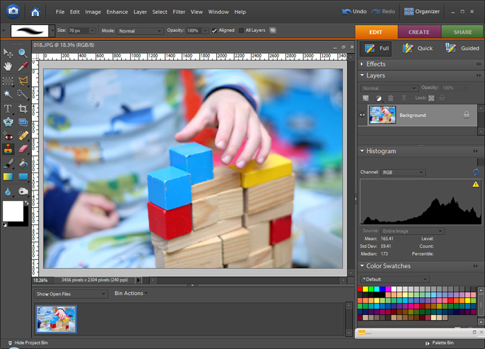
I like color, but more often than not I find myself toning down most of my photos and not embracing the bright colors. Last evening I was building towers with my kiddos in their bedroom, and when I saw these shots on my little LCD, I knew I couldn't make them black and white or muted, they had to keep that punch.
This is the photo with a bit of levels adjusted.
First I made a duplicate of my background and opened up SmartCurve. I made an S Curve and how I did this was by holding down ctl and selecting a lighter area (highlight) and it placed the top marker on the curve. Then I held down ctl and found a shadowed area, clicked it and it placed the lower marker on the curve. Then the top marker is dragged to the left, lower marker dragged to the right, and there's the S Curve. The S curve is good for adding contrast and bringing out color. I don't know the science behind it, I just know why my eyes see.
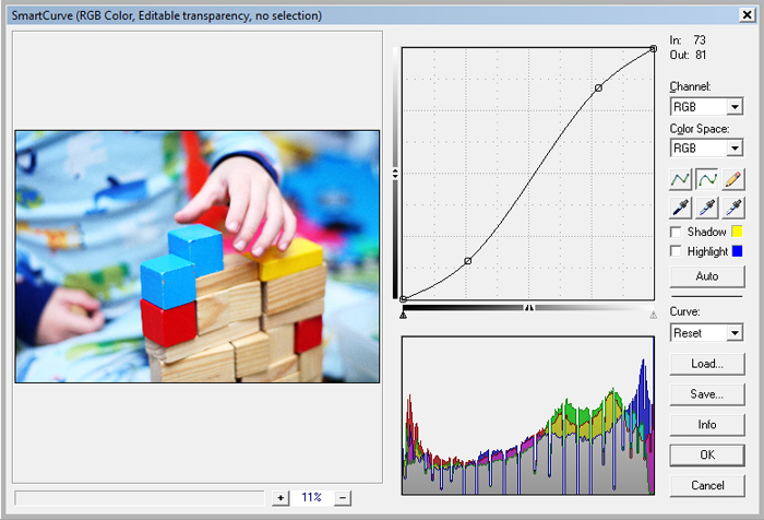
The reason I do the curves layer on a duplicated layer is because I want it to act like an adjustment layer, or non destructive. I want to be able to go back and tweak the opacity if it's too much or change the blend mode to give me a little something different.
I use blend modes a lot, and they are very neat things to work with. You can really change up the way a photo looks just by duplicating and changing blend modes. You should give it a shot, just duplicate the background of any image you're working on and go through the blend modes.
So with this curves 'adjustment' layer I changed the blend modes to see what I could get out of this simple S curve. The results are subtle, but each are nice in their own way.
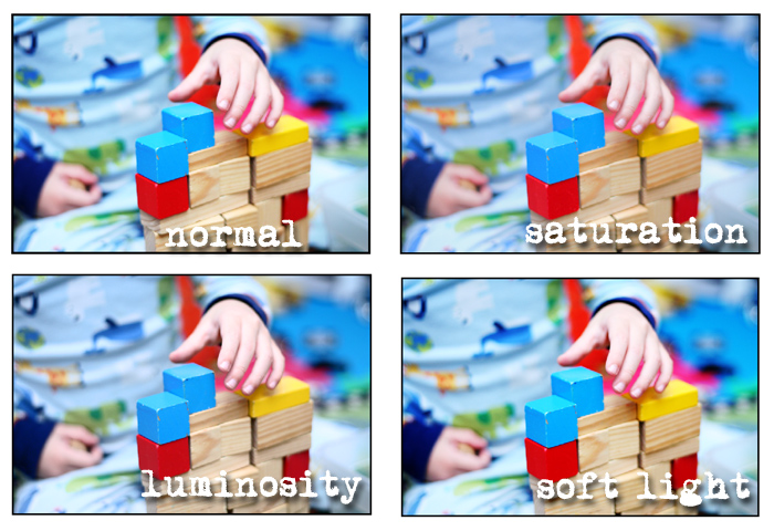
Normal: The photo is bright with nice contrast
Saturation: The colors are a little deeper and there's more detail because the lighter areas aren't so close to clipping
Luminosity: The colors became more deep, a little muted.
Soft Light: Pretty close to the normal mode, with a just a bit less brightness
At this point you could adjust opacity, maybe even duplicate this layer and try a new blend mode on top of another one or double up on the effect by duplicating and leaving the blend mode the same.
I like color, but more often than not I find myself toning down most of my photos and not embracing the bright colors. Last evening I was building towers with my kiddos in their bedroom, and when I saw these shots on my little LCD, I knew I couldn't make them black and white or muted, they had to keep that punch.
This is the photo with a bit of levels adjusted.
First I made a duplicate of my background and opened up SmartCurve. I made an S Curve and how I did this was by holding down ctl and selecting a lighter area (highlight) and it placed the top marker on the curve. Then I held down ctl and found a shadowed area, clicked it and it placed the lower marker on the curve. Then the top marker is dragged to the left, lower marker dragged to the right, and there's the S Curve. The S curve is good for adding contrast and bringing out color. I don't know the science behind it, I just know why my eyes see.
The reason I do the curves layer on a duplicated layer is because I want it to act like an adjustment layer, or non destructive. I want to be able to go back and tweak the opacity if it's too much or change the blend mode to give me a little something different.
I use blend modes a lot, and they are very neat things to work with. You can really change up the way a photo looks just by duplicating and changing blend modes. You should give it a shot, just duplicate the background of any image you're working on and go through the blend modes.
So with this curves 'adjustment' layer I changed the blend modes to see what I could get out of this simple S curve. The results are subtle, but each are nice in their own way.
Normal: The photo is bright with nice contrast
Saturation: The colors are a little deeper and there's more detail because the lighter areas aren't so close to clipping
Luminosity: The colors became more deep, a little muted.
Soft Light: Pretty close to the normal mode, with a just a bit less brightness
At this point you could adjust opacity, maybe even duplicate this layer and try a new blend mode on top of another one or double up on the effect by duplicating and leaving the blend mode the same.
Wednesday, January 20, 2010
Warm Toning
I used to love the sepia toning on photos, like love love it. I'm not that big a fan of it anymore, a lot of photos with it seem too cheesy or too monochromatic (in the same boat with the too grey black and white).
So I set out to get a photo style that still had sepia toning, but allowed some color through.
As I was going back through my screenshots there were a few places where I could see that the photo could be left alone right there and it would be great, so this could be 3 different processing techniques in one.
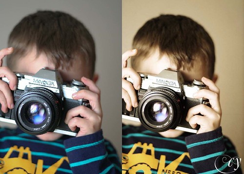
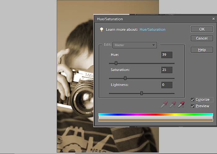
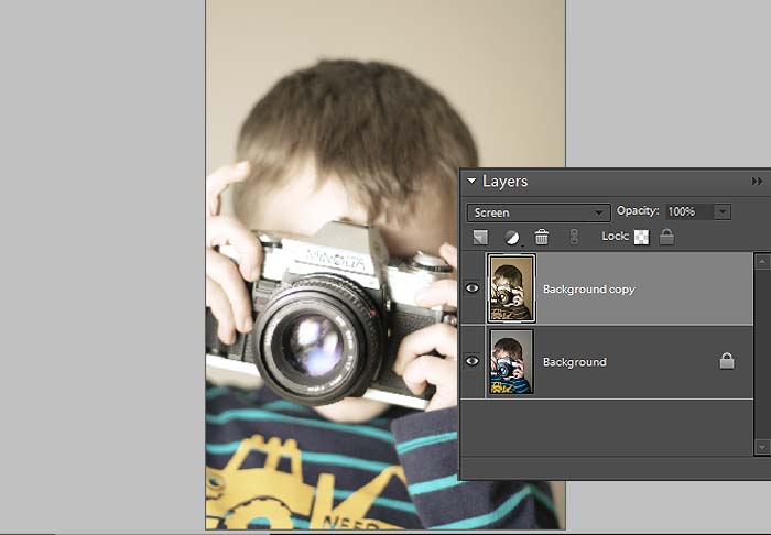
Open the photo you want to tone in your editor. Do all adjustments now (you know: levels, eye sharpening, cloning, etc). Then make a hue/saturation adjustment layer. Click colorize and move the hue slider to a brown color (anywhere between 25 and 40). If you stop at this point you've got a sepia toned photo.
I'm going to change the blend mode to screen. I like the way this looks, washed out but still toned, I like the bit of lowered contrast too. If you lose too much detail dial back the opacity some. Again, you could stop right here.
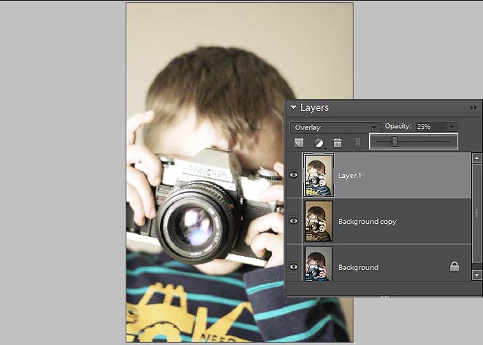
To add back a little of that contrast you're going to stamp visible and change the blend to overlay. Stamp visible, what tha? Ok, you get there by pressing alt+ctl+shift+e, and all of the visible layers merge and it makes a new layer of what you're flattened image would look like (pretty cool, huh?). Play with opacity.
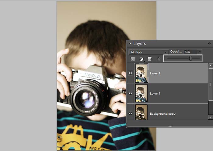
Stamp Visible again and this time set it to multiply, this is going to darken the photo and bring out some more color.
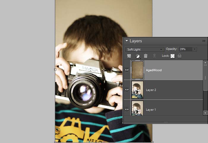
Now add a texture if you feel froggy. I used Aged Wood from Shadowhouse Creations, set it to soft light and lowered the opacity. It gives the photo a nice vignette and grit.
The toned photo:
Friday, January 15, 2010
Thursday, January 14, 2010
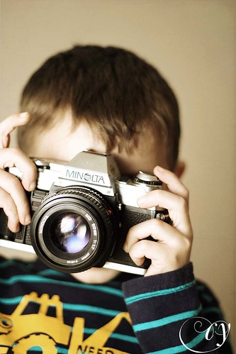
Shutterbug
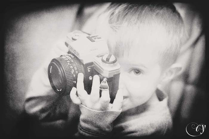
Starting 'em off early!
And also, you're going to want to check this out. A whole slew of gorgeous actions that can be used in Elements. Thanks Nelly Nero!
The above photo was processed using the Headline BW, an action that you can get at the above link and a texture from SkeletalMess.
Subscribe to:
Posts (Atom)