Tuesday, January 26, 2010

Adjusting Color, using Curves and Blend Modes

Photoshop Elements doesn't have a Color Curves tool like other photo editing programs, but there are plug-ins that do an amazing job.  I use the SmartCurve plug in, and I really like it.  It's also free, so that's pretty neato as well.

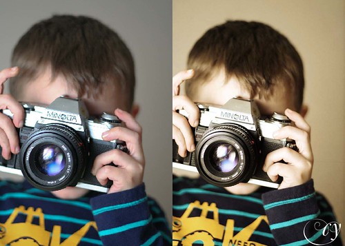
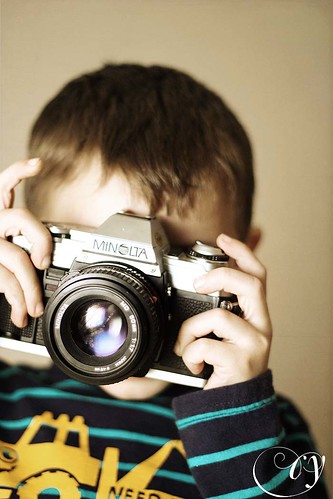
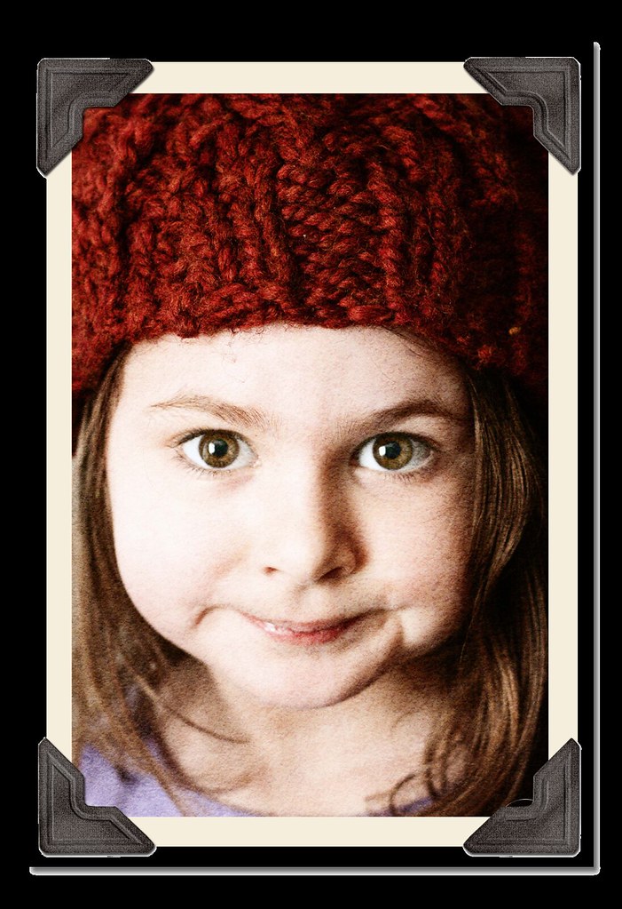
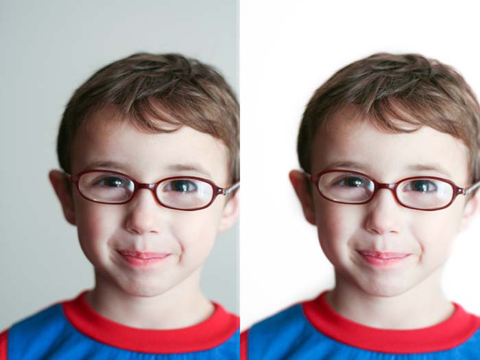
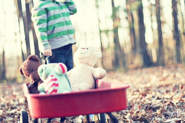
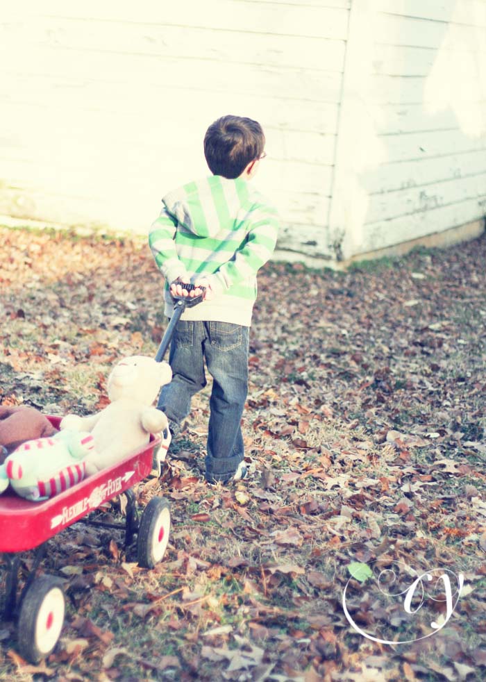
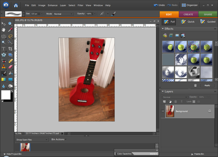
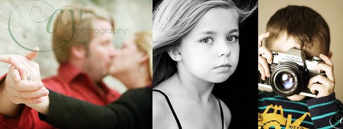
I like color, but more often than not I find myself toning down most of my photos and not embracing the bright colors.  Last evening I was building towers with my kiddos in their bedroom, and when I saw these shots on my little LCD, I  knew I couldn't make them black and white or muted, they had to keep that punch.

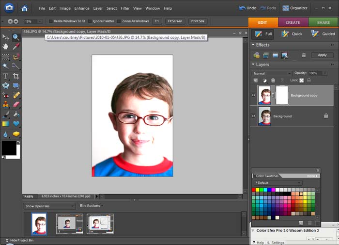
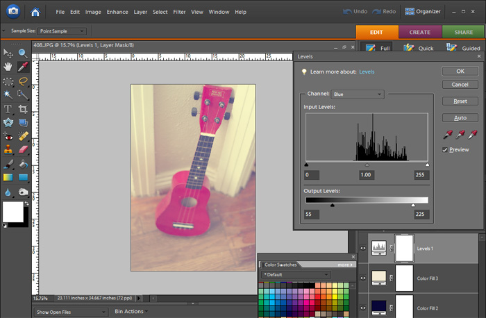
This is the photo with a bit of levels adjusted.

Untitled-1

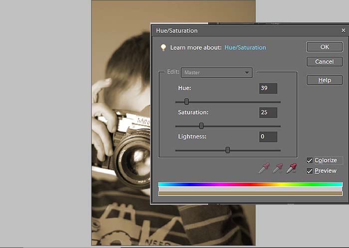
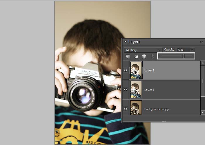
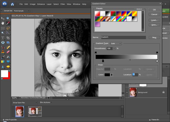
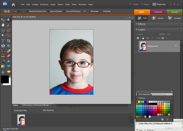
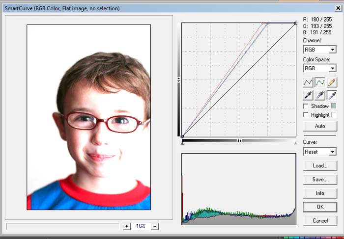
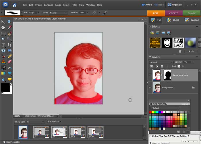
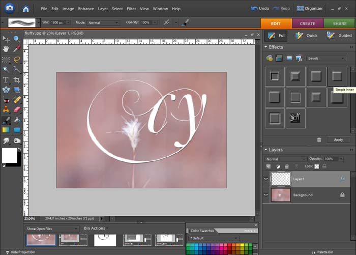
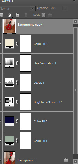
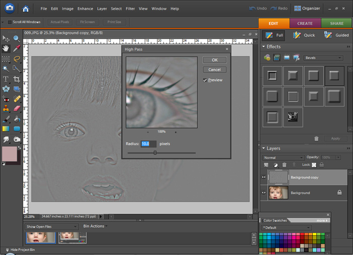
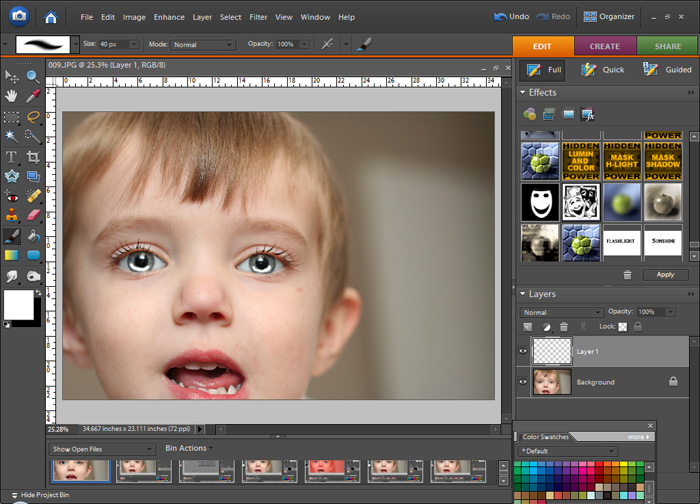
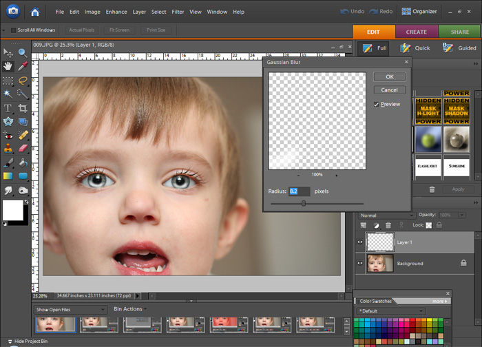
First I made a duplicate of my background and opened up SmartCurve.  I made an S Curve and how I did this was by holding down ctl and selecting a lighter area (highlight) and it placed the top marker on the curve.  Then I held down ctl and found a shadowed area, clicked it and it placed the lower marker on the curve.  Then the top marker is dragged to the left, lower marker dragged to the right, and there's the S Curve.  The S curve is good for adding contrast and bringing out color.  I don't know the science behind it, I just know why my eyes see.

Untitled-2

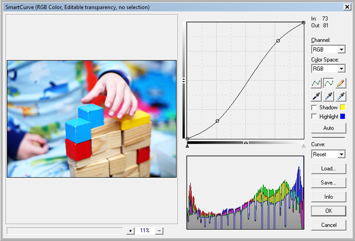
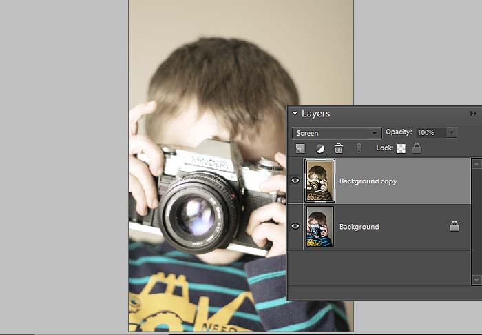
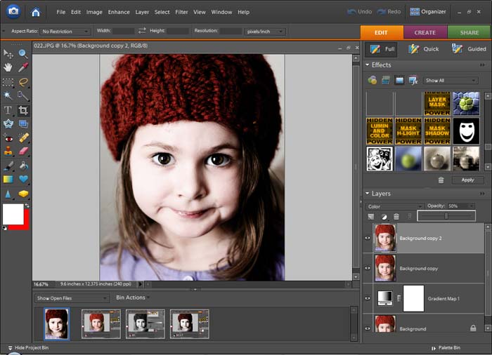
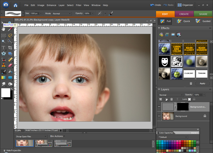
The reason I do the curves layer on a duplicated layer is because I want it to act like an adjustment layer, or non destructive.  I want to be able to go back and tweak the opacity if it's too much or change the blend mode to give me a little something different.

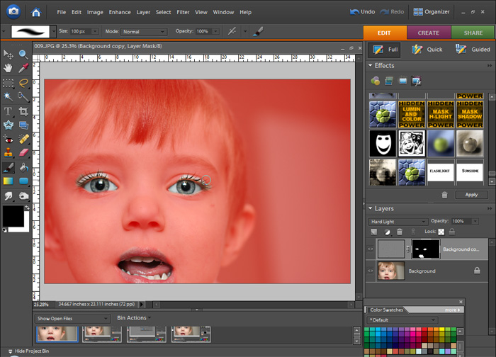
I use blend modes a lot, and they are very neat things to work with.  You can really change up the way a photo looks just by duplicating and changing blend modes.  You should give it a shot, just duplicate the background of any image you're working on and go through the blend modes.

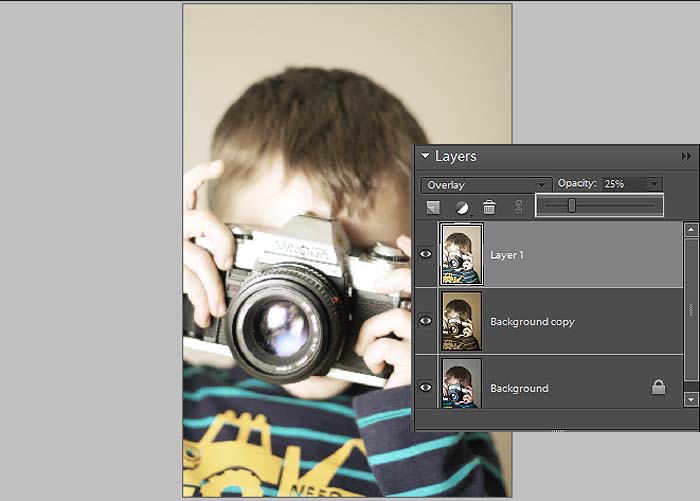
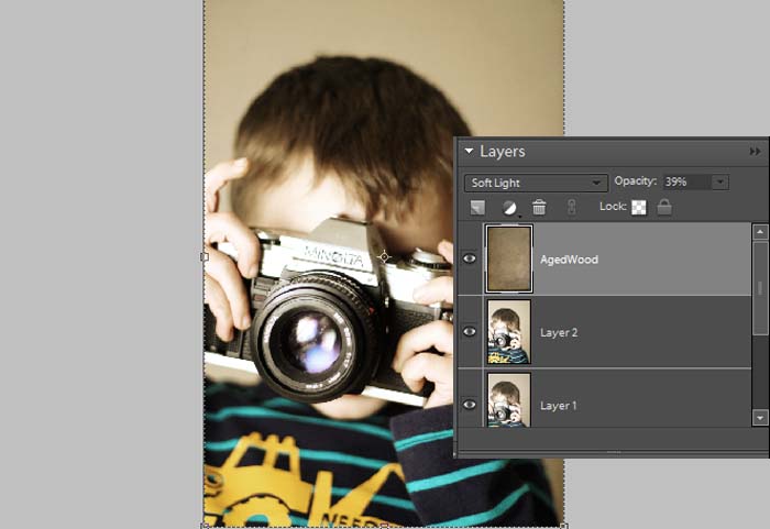
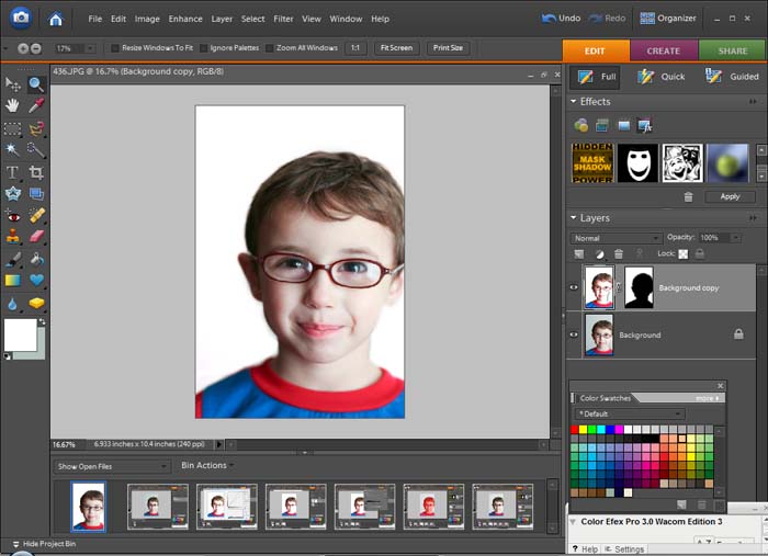
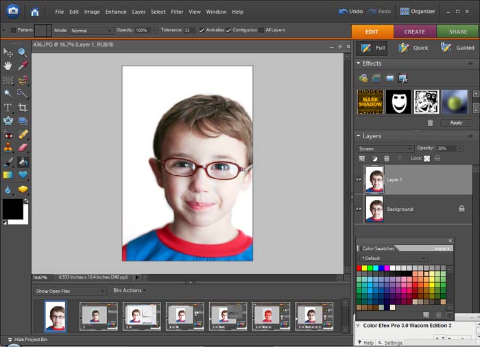
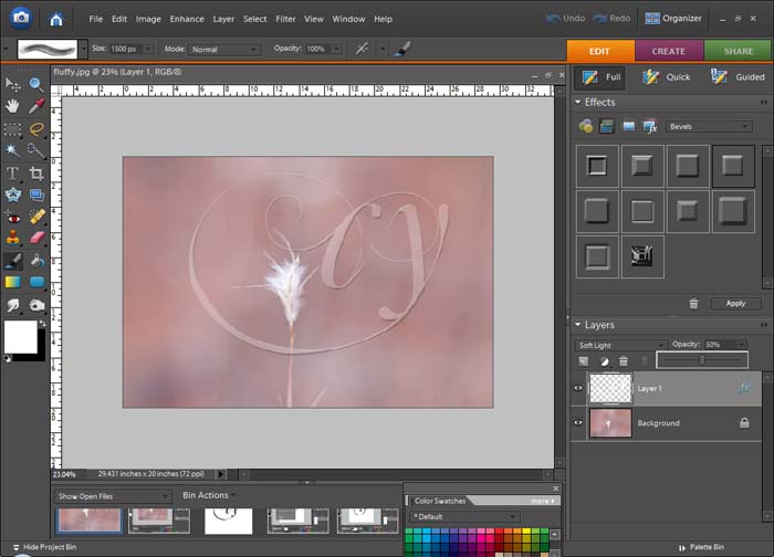
So with this curves 'adjustment' layer I changed the blend modes to see what I could get out of this simple S curve.  The results are subtle, but each are nice in their own way.

Untitled-3

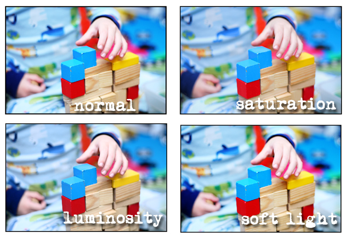
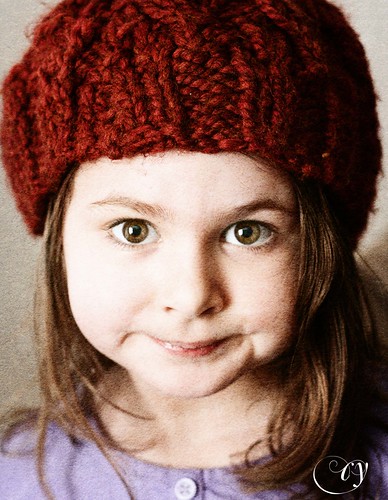
Normal: The photo is bright with nice contrast
Saturation: The colors are a little deeper and there's more detail because the lighter areas aren't so close to clipping
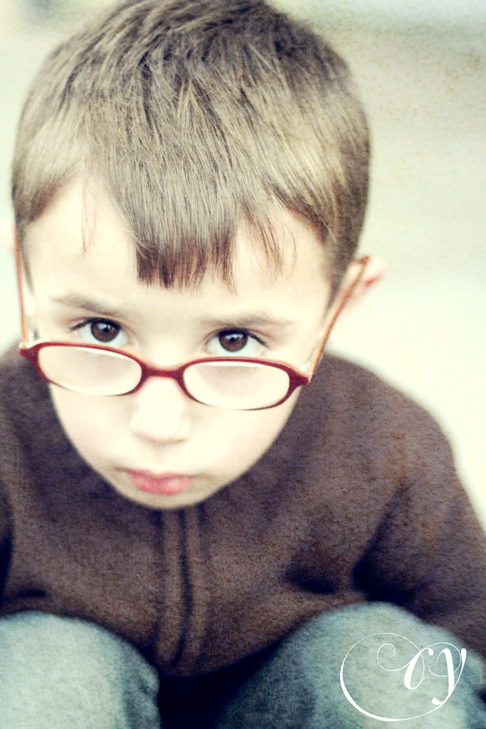
Luminosity: The colors became more deep, a little muted.
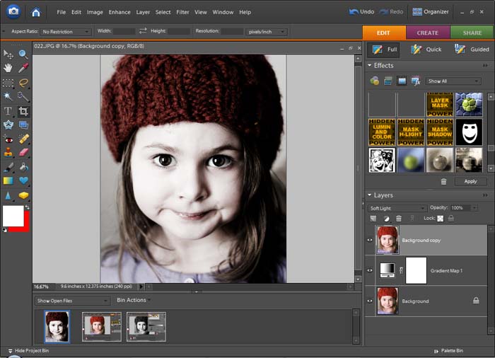
Soft Light: Pretty close to the normal mode, with a just a bit less brightness

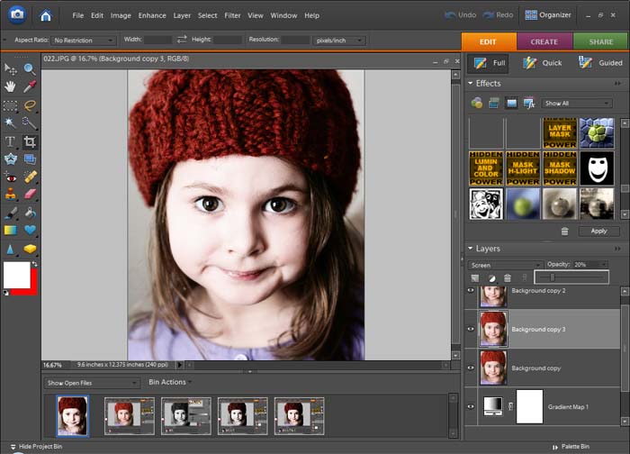
At this point you could adjust opacity, maybe even duplicate this layer and try a new blend mode on top of another one or double up on the effect by duplicating and leaving the blend mode the same.

Wednesday, January 20, 2010

Warm Toning

I used to love the sepia toning on photos, like love love it.  I'm not that big a fan of it anymore, a lot of photos with it seem too cheesy or too monochromatic (in the same boat with the too grey black and white).

So I set out to get a photo style that still had sepia toning, but allowed some color through.

As I was going back through my screenshots there were a few places where I could see that the photo could be left alone right there and it would be great, so this could be 3 different processing techniques in one.


beforeandafter

Open the photo you want to tone in your editor.  Do all adjustments now (you know: levels, eye sharpening, cloning, etc).  Then make a hue/saturation adjustment layer.  Click colorize and move the hue slider to a brown color (anywhere between 25 and 40).  If you stop at this point you've got a sepia toned photo.

Untitled-2

I'm going to change the blend mode to screen.  I like the way this looks, washed out but still toned, I like the bit of lowered contrast too.  If you lose too much detail dial back the opacity some.  Again, you could stop right here.

Untitled-3

To add back a little of that contrast you're going to stamp visible and change the blend to overlay.  Stamp visible, what tha?  Ok, you get there by pressing alt+ctl+shift+e, and all of the visible layers merge and it makes a new layer of what you're flattened image would look like (pretty cool, huh?).  Play with opacity.

Untitled-4

Stamp Visible again and this time set it to multiply, this is going to darken the photo and bring out some more color.
Untitled-5
Now add a texture if you feel froggy.  I used Aged Wood from Shadowhouse Creations, set it to soft light and lowered the opacity.  It gives the photo a nice vignette and grit.

Untitled-6

The toned photo:

benwcam

Friday, January 15, 2010

B

B

Thursday, January 14, 2010

Shutterbug

J with camera

Starting 'em off early!

And also, you're going to want to check this out.  A whole slew of gorgeous actions that can be used in Elements.  Thanks Nelly Nero!

The above photo was processed using the Headline BW, an action that you can get at the above link and a texture from SkeletalMess.

Wednesday, January 13, 2010

Edgy Vintage using Layers and and Texture

I'm always amazed at what other photographers and designers can do with textures.  I usually forget all about them when processing photos.

This was an accidental technique that I stumbled upon while trying to convert to black and white (I'll write up my method soon).  Part of what I do is create a gradient map and then duplicate it and set it to soft light for contrast.  Well, this particular time I duplicated the background layer instead and got a pretty neat effect.  I kept going with it and I'm pleased with the outcome.  Added a texture and I'm super proud of it.

ry plain
First open a photo in your editor. I'm using PSE 6.  I've made a few adjustments in ACR and worked on her eyes just a bit.
Untitled-1

Next step is to turn it black and white.  I use a gradient map.  If you have another method, just make sure that there is a layer of the original and the black and white is a copy on another layer.

Untitled-2

Duplicate the background, set the blend mode to soft light and drag it to the top of the layer stack.

Untitled-3

I liked this so far, but felt it needed a little more punch.  It's good, but it's just too desaturated for me.  I duplicated the background layer again, set the blend mode to color and put it on top of the stack.  I reduced the opacity to 50%.

Untitled-4

I felt like this could use a little highlight at this point, so I duplicated the background again and set the blend to screen and used a rather low opacity.

Untitled-5
I duplicated the background and used the dodge tool on her eyes, with the different layers they got a little lost.  Dodging on a layer gives you a chance to pull it back if it's too much.

I was done there, but it was just missing something, so I added a texture.  The texture is courtesy of Melissa from Groovy Chick.  It's the Sandstorm texture.

There are multiple ways of placing a texture on an image.  For this example I placed it on the photo (file>place). 

Untitled-6

Then I transformed it until it covered the entire image.

Untitled-7
Using different blend modes can be fun at this point, the light modes give a wide range of different looks.  Screen and multiply are also great. I'm using soft light.
Untitled-8

The final version, using the photo corner frames courtesy of Rita from CoffeeShop

ry

Monday, January 11, 2010

Ry.

R vintage

Saturday, January 9, 2010

Turning a background white in PSE

It's really not hard to get a consistent background color or to fix a wrinkled backdrop in PSE.
I'll show you how in a few easy steps that require either curves or levels and masking.


white background

Open the photo you want to work on in PSE.  I'm using a JPEG, but I open it in ACR so that I can tweak a few things, other than that this is SOOC.  You can see that the background is grey, it's the wall in my living room. It's actually a greyish beige, but I'm going to turn it white.

Untitled-1

First I'll show how to do it in curves (which of course is not available in PSE unless you use a plug in or action, I'm using SmartCurve).  Duplicate the background and open curves. Choose the white dropper and select the darkest area of the background.  This will make the whole photo look crummy, and you're background will likely blow out
Untitled-2

Or if you'd rather use levels, it's the same steps.  With levels you can just use an adjustment layer, and it will create a new layer and already have a layer mask on it.  If you use this method you can skip the next step.
Untitled-4

Now, mask the layer.
Untitled-3

At this point I lower the opacity of the layer that changed the background to white so that I can see what I'm doing.  I'm going to paint over my subject so that I can retain the colors on him.  Click on the layer mask while holding alt and shift to turn the area you are masking red.
Untitled-5

Alt +shift+click the mask again and raise the opacity back up to see what you've got.
Untitled-7
You might want to lower the opacity a bit so that it looks a little more natural.  Then flatten the layers.

Duplicate the layer and set the blend mode to screen to brighten up the whole photo, and lower the opacity a bit.

Untitled-8


white background

It's basically the same for a black backdrop, just use the black eyedropper.

Hope that's useful to someone!

Wednesday, January 6, 2010

Watermarks

final
Watermaking an image helps to protect that photo from being copied or printed without your permission. 

It's pretty simple to do.

First you need to create a brush or a shape that will serve as the watermark.  You can use your logo, your name, your initials, the copyright symbol (which can be typed by holding alt and the numbers 0169 on the keypad--©).

To create a brush I created a blank document, I believe this was 500 x 500 pixels, 300 dpi.  Then I chose an ornamental font and typed my initials with black as the foreground color on a white background.
ss2

Then choose Define Brush from the Edit menu, and now it will show up in your brushes palette.  You can save a set of watermark brushes with the preset manager.


ss3

Open the photo you will be watermarking and create a new layer (shift +ctl +n).  Choose the brush that you'll be using as the watermark and choose white as the foreground color.  Place the watermark wherever you want on the photo.
ss4
To give it some depth go to the layer styles button on the effects palette and choose bevels.  This will raise the brush stroke.  Try out some bevels, I chose "simple inner" for this one.

ss5
 Set the watermark layer's blend mode to soft light and adjust the opacity if it's too strong.  You don't want it to overpower the photo.
ss6

That's it!

final

Old friends and new friends

old friends & new friends

B

Tuesday, January 5, 2010

Dreamy

There is a certain processing style that I've been trying to achieve for a while now.  Then today it just made sense and I give you this:


It's washed out and hazy.  It works well on portraits and photos of objects.  It has a dreamy feel about it and it manages to keep a good bit of saturation while being toned down.  You could even use it on a photo of your kid with spaghetti stains on his face!  I like it lots.  You can manage this whole thing in PSE without using any plugins or actions (woo hoo!)


First open your photo in your editor.

ss1

This might make it easier, it might make it more confusing, but I've saved the swatches of the colors that I'm using here and you can download the .ACO file HERE.
*After you download it, open Preset Manager in PSE.  Choose swatches from the drop down menu.  Click load and find the .ACO file and they will show up in your swatches palette.  You can toggle the swatches palette on in the windows menu.

Make two color fill layers. And set them like this
1. 9bae9e, soft light, 100%
2. 080638, exclusion, 100%

Now create a levels adjustment layer, choose blue from the drop down menu and change the output levels to 55 and 225.

This part is optional, but if you want at this point you could do a hue/saturation adjustment layer and either bump up the saturation or bring it down a bit.

ss2

Create brightness/contrast adjustment layer and raise the contrast to 50

Then create a third color fill layer of #f4ecd6 and set the blend mode to soft light.

This will create a very washed out photo.  You will most likely want some contrast brought back in.  Duplicate the background layer and bring that to the very top.  Set the blend mode to soft light and bring the opacity down to about 50.

Your layers should look something like this:

ss3

Adding life to the eyes in a portrait


In a portrait, more often than not, focus is on the eyes.  The eyes are what draw you in, connect you with the photo, show emotion, etc. I'm going to teach you how to bring a little extra life to the eyes in Photoshop, without overdoing it.

When shooting a portrait, a good rule of thumb is to focus on the eye closest to the camera.  Another thing you want to look for when taking a portrait are catchlights in the eyes (those reflections of light in the eye), also try to not get shadows that are falling directly under the eye.  Lack of catchlights and the undereye shadows result in "dead eyes".

Now for post processing, open your photo in the editor you use.  I'm using Photoshop Elements.
ss1

The first thing I do is sharpen the facial features, I do the eyes and the lips generally.  This can save a photo that's just a bit out of focus as well.

Duplicate the background layer and put a high pass filter on (filters>other>high pass).  High pass filter at 10 seems to get me where I want most of the time.

ss2

Now change that layer's blend mode to hard light, and put a layer mask on the layer and fill the mask with black.  Your photo now looks exactly like it did when you started.

ss3

If you hold down alt and shift while clicking the layer mask everything that is masked will turn red.  This is handy to use when you're masking smaller details.

Use a soft white brush with white as the foreground color and paint over the eyes, catching some of the eyelashes and other facial features you want to bring out.

ss4 
That looks a little creepy!

(alt +shift +clicking the layer mask will toggle the red overlay on and off).

Adjust the opacity of the layer and flatten.

ss7

The next step will brighten the iris just a bit.
Create a new blank layer (shift+ctl+n). Use a soft white brush and paint on the side opposite the catchlight.

ss8

Put a gaussian blur filter on that layer.  Use a radius that just softens the white, but doesn't make it bleed into the iris or the pupil.

ss9

Then change the blend mode to soft light and reduce the opacity until it doesn't look fake, just adds a bit of brightness to the eye.

ss5

And you're done!