


I used to love the sepia toning on photos, like love love it. I'm not that big a fan of it anymore, a lot of photos with it seem too cheesy or too monochromatic (in the same boat with the too grey black and white).
So I set out to get a photo style that still had sepia toning, but allowed some color through.
As I was going back through my screenshots there were a few places where I could see that the photo could be left alone right there and it would be great, so this could be 3 different processing techniques in one.
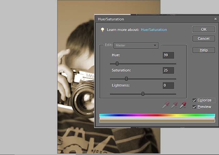
Open the photo you want to tone in your editor. Do all adjustments now (you know: levels, eye sharpening, cloning, etc). Then make a hue/saturation adjustment layer. Click colorize and move the hue slider to a brown color (anywhere between 25 and 40). If you stop at this point you've got a sepia toned photo.
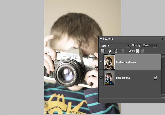
I'm going to change the blend mode to screen. I like the way this looks, washed out but still toned, I like the bit of lowered contrast too. If you lose too much detail dial back the opacity some. Again, you could stop right here.
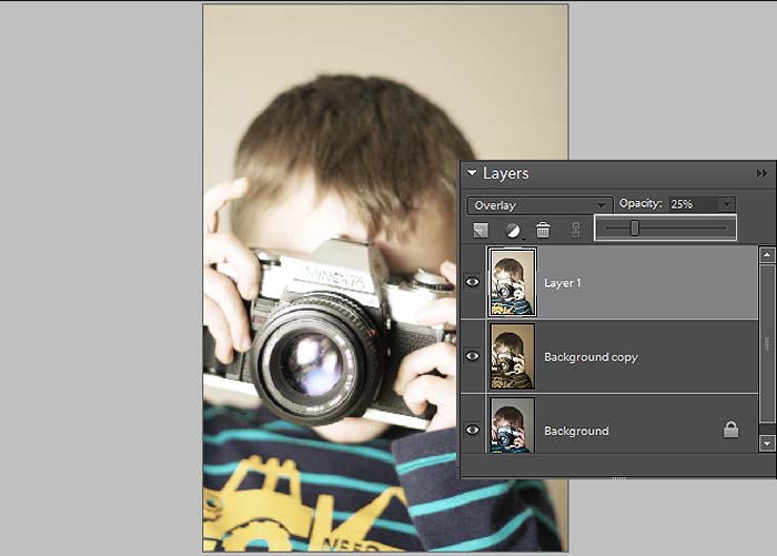
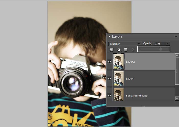
To add back a little of that contrast you're going to stamp visible and change the blend to overlay. Stamp visible, what tha? Ok, you get there by pressing alt+ctl+shift+e, and all of the visible layers merge and it makes a new layer of what you're flattened image would look like (pretty cool, huh?). Play with opacity.
Stamp Visible again and this time set it to multiply, this is going to darken the photo and bring out some more color.
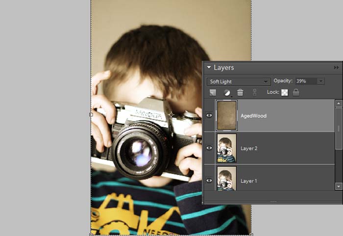
Now add a texture if you feel froggy. I used Aged Wood from Shadowhouse Creations, set it to soft light and lowered the opacity. It gives the photo a nice vignette and grit.
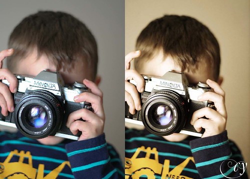
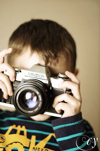
The toned photo:

No comments:
Post a Comment